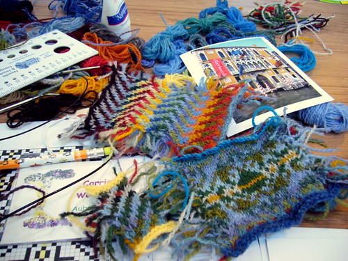
Wow, that was a lot of information to try and absorb in a weekend! The photo above illustrates how scrambled my brain was by Sunday evening--I think that I stopped being able to register different colors at all for an hour or so. I actually dreamt about swatching last night, which I'm pretty sure was a first for me. In other words, this is probably the most inspiring knitting class that I've ever taken. I'm not really the kind of person who tries to knit meaning into projects (though I try not to knit hate into them), but I really loved the idea of starting with a photograph for design inspiration and translating the colors (in some cases very loosely) into a traditional(-ish) Fair Isle design. I'm still trying to sort all of this out in my brain (and am second-guessing my photo color-correcting abilities, too), and I'm hoping that writing it all out will help. This is a much longer post than usual as a result. If I'm missing anything, let me know. If I'm way too wordy, just skim.
I apologize in advance that I have very little to share about the work that other people did in class--it felt like we were moving too fast to take photos most of the time. There were some amazing color combinations and swatches--watching everyone move through the process was extremely valuable.
Part I: Inspiration and Initial Color Selection
Janine has some great photos (and a much more concise explanation) of this stage here.
My starting point was this photo that I took when I was in Venice in May--it's also in the upper right hand corner of the photo above. I love the colors of the water in Venice, and the blue of the sky, and the colors of the buildings. Plus, there are smaller bits of red, brown, green, and white--in other words, there's plenty to work from.
The first step was to pick out a ton of colors (from Janine's T-O-N-s of yarn) representing colors in the photo but in many different values. Then you arrange them in value order, without regard to hue, split them in half, and "speed swatch" them together. Value is really tricky for me, especially when trying to decide, for instance, where a deep green goes compared to a deep yellow. It's something to practice, but in the meantime a trick is to look at colors in black and white to see the differences. Here's my speed swatch, both in color and in black and white:
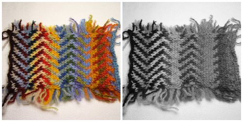
I started swatching darkest to lightest, and moving towards the middle. Very festive, isn't it? Almost like Kaffe Fassett's Circus Tents quilt, was my first reaction. I accidentally zigged when I should have zagged, and instead of having a "mistake" in my swatch, I just kept on zigging and zagging. This makes it a little tougher to see the individual lines, especially once the values get closer to the middle. I can see in the black and white version where there are abrupt value changes, though.
Part of what I know about color I stole from my former roommate E___ who is a graphic designer with a great eye for color, and most of the rest of what I know comes from quilting, where I'm generally looking for sharp value changes or minimal value changes with a small bit of contrast for "pop". Fair Isle is about very gradual value changes, or progressions of even value changes, which is a different skill altogether (at least for me).
I seriously hated this swatch when I first knit it (even if I do like some parts of it), but it is starting to grow on me. It was interesting to hear other people in the class say that they liked different parts of it than I do. If I did it again I would change the way I ordered the colors, so that I was matching darkest to middle and working towards middle to lightest, instead of starting with the highest contrast. And I'd lose some of the peachier shades, maybe. And it would be the perfectest color swatch in the world, on first try--I just know it would.
Part 2: Refine Colors, Select Motifs, and Swatch Some More
I'm not going to go into how I selected motifs, or where they came from, because honestly I didn't document my sources well enough. I basically started with an all-over pattern with motifs inside diamond shaped frames that fit together. I selected the motifs from several different books, and charted out a couple on my own. I wanted to try one that reflected the cross-shaped windows on the building in my inspiration photo, but otherwise wasn't trying to be literal at all about the motifs. I started with a swatch of just one of the five motifs I ended up with, one that had a pretty solid center. I was going for a heavier weight center, which as it turns out was a mistake:
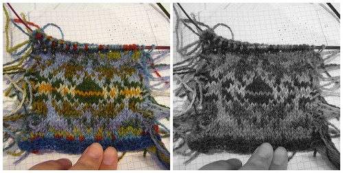
See how my "startle color" in the middle of the motif looks like just a line? That's not the effect I was going for. Also, you can see in the black and white photo that there isn't much value difference between the greens and the blues in the lower part of the photo. Don't even get me started on how I skipped a pattern line, and didn't realize it until the next day. I decided to throw out some of the lighter greens, and add it some darker greens. Before starting another swatch (which I knew needed to be much bigger), I made a tiny speed swatch:
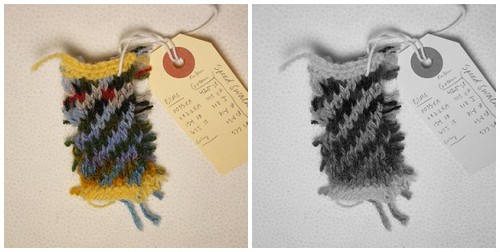
There's still some value muddiness at the bottom of the swatch, but I'm much happier overall. The grey fit in value-wise, but I didn't like the hue change from blue to grey, so I selected another light blue to use instead. In the evening, I charted out the motifs in Excel, and made some changes that I thought would help with that whole "yellow line" issue. I've started my large swatch, but am less than half-way through it so it's a little early for me to pass judgement upon it. This is how it looks so far:
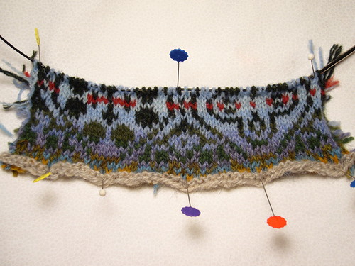
Much better, yes? I'm a little concerned that now I have a red line issue to worry about, but until I have a whole swatch that I can look at from 10 feet away, I'm not going to make any changes. I did order full skeins of all 10 or 11 colors in the swatch last night as soon as I got home from class, but that's not a real committment. Right now, I'm not thinking that this type of allover motif is something that I would wear as a sweater, but I might like to try it as a pillow cover or some other small project. Again, it's really too early to tell--this is not a project that's going to move forward quickly.
I'll talk about the last part of the class (steeks & sweater design) more in another post. All of this talking about the class is both reminding me how tired I am, and has got my fingers itching to continue the swatch. Plus, I've got a too-tight cast-off to pick out on the Smooshy socks, and some ice cream to eat. It's been H-O-T here!


3 comments:
Wow! Thanks for sharing the photos and the process you went through. It looks like a lot of fun.
Interesting! Love that last swatch! If I could only get my knitting mojo back!
I like the color combos you choose. I think they look great! (PS: No, I didn't visit your part of the country--hopefully the hot weather is gone by now!)
Post a Comment